


EVERYTHING STARTED AS A BLANK ARTBOARD
Real client work, plus a few things made purely because they were fun. Both tell you something, so it’s not just about looks.
OUT IN THE REAL WORLD
Paid jobs for South African businesses, now printed, signed and in use.

MAGNUM SECURITY
Logo and business cards for a security company. A shield-and-chevron mark in deep red and steel, built to look solid on a card, a uniform or a vehicle door.


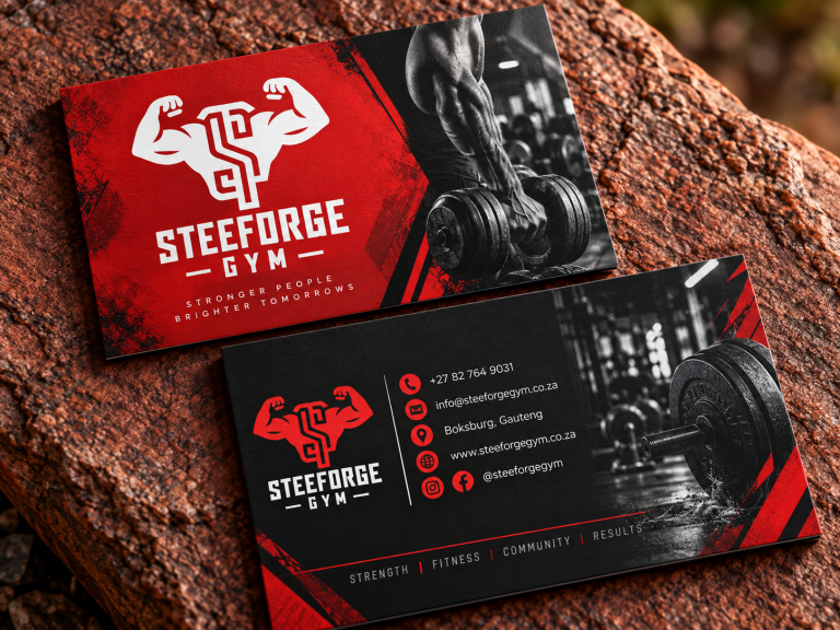
STEEFORGE GYM
Branding for a strength gym. A flexing figure whose body forms the S, in white on hard red, bold enough for a wall, a shirt or a gym bag.

Five identities, start to finish
Each one began as a real-world design brief rather than a paid job,
so every decision on the page is the studio's own: logo, system,
and the collateral that proves it works.

01
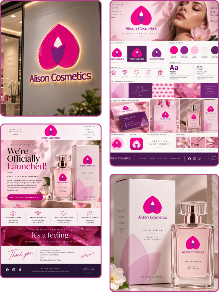
ALISON
COSMETICS
THE BRIEF
An online beauty store whose old logo was just a typeface: forgettable, and weak as a social media profile picture.
THE ANSWER
A petal-and-drop mark in fuchsia and plum that still reads at thumbnail size, rolled out across perfume packaging, a launch email and illuminated signage. Tagline: Beauty in every moment.
DELIVERED
02
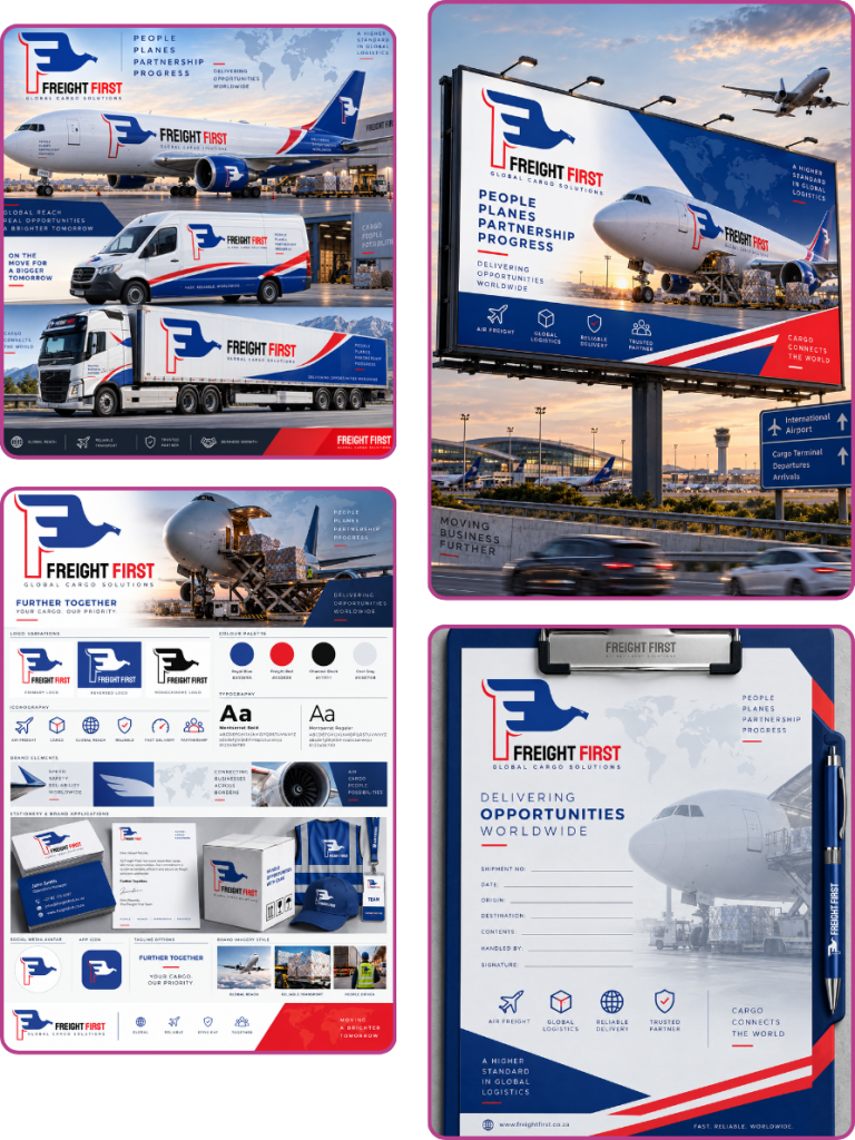
FREIGHT FIRST
THE BRIEF
A freight broker needed a logo overnight to anchor an investor pitch the following morning.
THE ANSWER
An eagle built into the letter F, in royal blue and freight red. It was tested where logistics brands actually live: aircraft, van and truck livery, a roadside billboard and the paperwork. Tagline: Further together.
DELIVERED
03
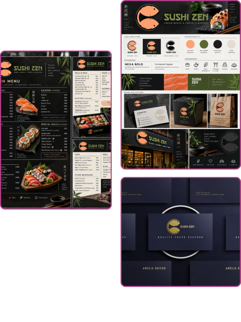
SUSHI
ZEN
THE BRIEF
A small, traditional sushi restaurant needed one mark that works on signage, menus and serveware, and says authentic rather than trendy. Tagline: Fresh minds, fresh flavours.
THE ANSWER
Two koi circling into a single form, in salmon on charcoal with a zen green accent. It carries a full dine-in menu, takeaway packaging and gold-foil business cards. Tagline: Quality Fresh Seafood
DELIVERED
04
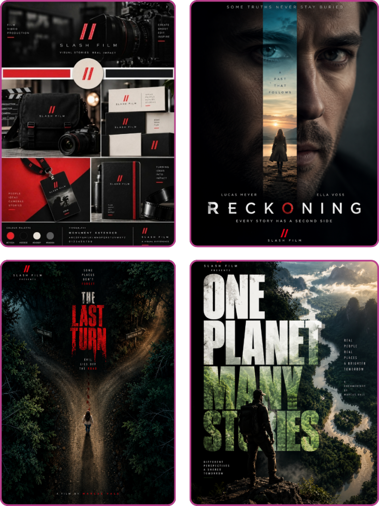
SLASH FILM
THE BRIEF
A film and video production company needed an identity with the confidence of the work it makes.
THE ANSWER
A red double-slash mark, the cut between two shots, set in wide Monument Extended type. It was proven on production kit and crew passes, then pushed to the limit on three original movie posters. Tagline: Visual stories, real impact.
DELIVERED
05
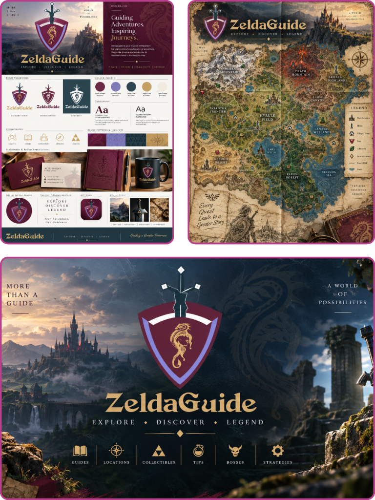
ZELDAGUIDE
THE BRIEF
A fan publisher of Legend of Zelda guides and videos kept switching visuals and was getting mistaken for other blogs. It needed its own identity, without leaning on Nintendo’s typeface or artwork.
THE ANSWER
An original crest-and-sword mark in burgundy and antique gold, with an adventurer’s tone throughout: an illustrated world map poster, a 12-icon content set and a YouTube channel banner.
DELIVERED
Built to work on a shopfront, a business card and a 40-pixel profile picture.
Made for the printer, not just the screen
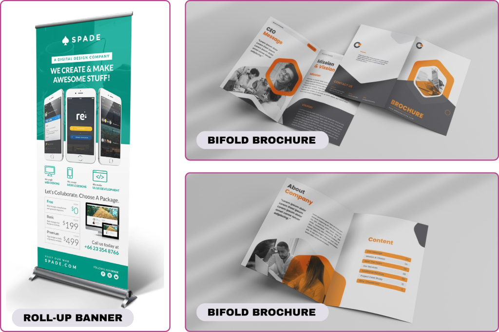
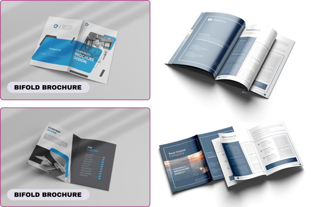
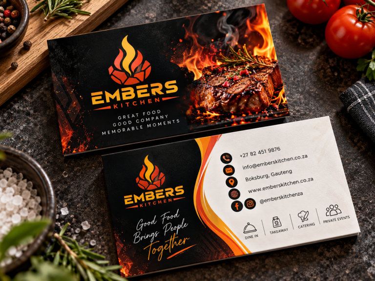
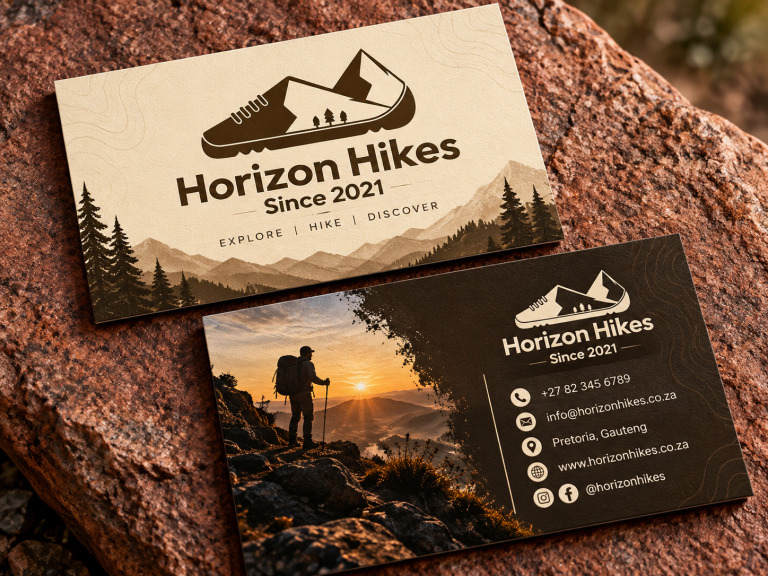
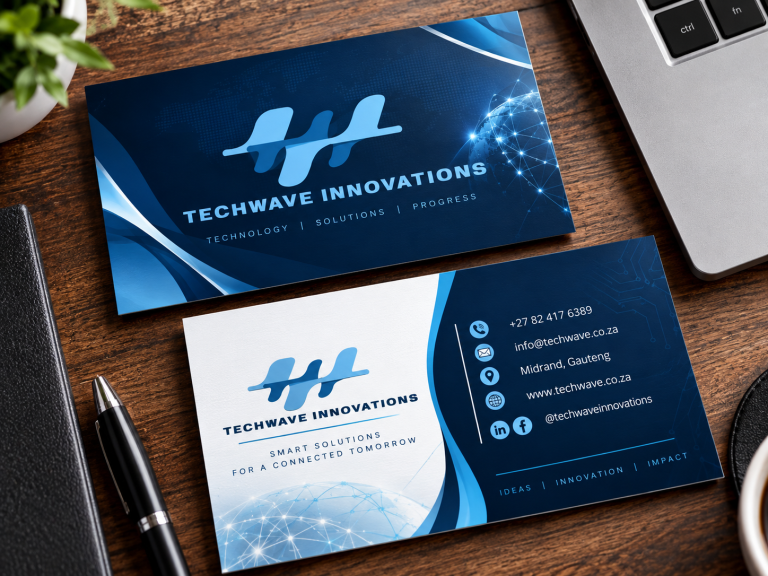
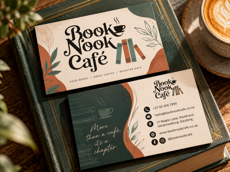
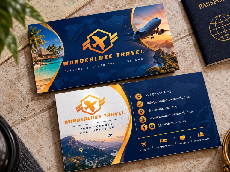
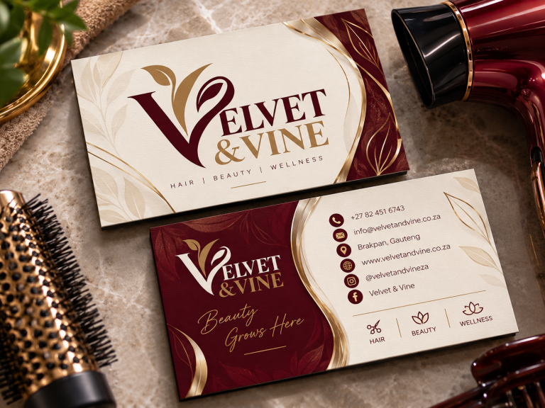
Brochures, roll-up banners and business cards, set up with bleed and CMYK.
BUSINESS CARDS


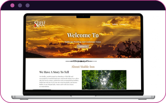
Built in WordPress & Elementor

STABLE INN
A wedding and conference venue site that leads with the view: a warm sunset hero, classic serif type, and a story told through the grounds.

SEEN ENOUGH? LET’S MAKE YOURS.
Tell me what you need designed. You'll get a straight answer on scope, price and timeline, usually the same day.